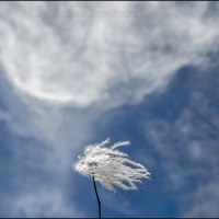
Sometimes a negative is positive

On August 29, 2017, we visited Cameron Lake in Waterton Lakes National Park, Alberta. Adjacent to the parking lot I noticed the curiously curved remains of a slender tree trunk that I felt compelled to take several pictures of.
While processing the photograph shown here, I accidentally hit a key combination that inverted the colors. I found the negative image pleasing, unreal though it was. Can you guess what it looks like? Try to imagine it, then click the blank frame below to see the fantasy forest.

© 2018 Steven Schwartzman


I can’t see it @my mobile 🤔
José Manuel
January 25, 2018 at 5:33 AM
Lo siento. I’m assuming at least the real picture showed up. I tried tapping on the blank frame on my iPhone and the hidden picture came up. I know each phone is different. The next time you’re at a regular computer, it’ll be waiting for you.
Steve Schwartzman
January 25, 2018 at 8:09 AM
Heuria d’haver dit “Ho sento”.
Steve Schwartzman
January 25, 2018 at 8:38 AM
LOVE it!
DailyMusings
January 25, 2018 at 6:36 AM
Happy inversion to you.
Steve Schwartzman
January 25, 2018 at 8:15 AM
The inversion makes it pretty much an abstract!
Indira
January 25, 2018 at 6:37 AM
It does indeed, and that’s why I like it.
Steve Schwartzman
January 25, 2018 at 8:15 AM
I like it. Not what I imagined. Is this what some drug trips are like?
Jim R
January 25, 2018 at 7:31 AM
Well, you’re a child of the 60s, so you’ll have to judge the authenticity for yourself.
Steve Schwartzman
January 25, 2018 at 8:16 AM
I admit to never trying mind altering drugs then. I lived too close to my home. Couldn’t risk showing up in the arrests column of the paper.
Jim R
January 25, 2018 at 10:10 PM
I can see how that would have given you pause.
Steve Schwartzman
January 26, 2018 at 7:07 AM
The colors in the negative image are nice, and the bent trunk certainly is more prominent. The effect is interesting, though my own preference is for the original.
shoreacres
January 25, 2018 at 7:50 AM
I prefer straight photography, too. I remember showing a negative only once before in the more than six years this blog has been running. Every now and then a little diversion seems okay, especially when triggered by an accident rather than intentionally.
Steve Schwartzman
January 25, 2018 at 8:20 AM
By the way, one thing I found interesting about the negative is that there are still some greenish areas in it. I didn’t expect that. I see now that they came from some parts of the original that were inconspicuously reddish, apparently enough that they became greenish when inverted.
Steve Schwartzman
January 25, 2018 at 8:56 AM
A Monet
David W Moll
January 25, 2018 at 7:51 AM
Or, given the inversion, a Tenom.
Steve Schwartzman
January 25, 2018 at 8:28 AM
My monitor started doing that, so I threw it out!
Robert W. Smith
January 25, 2018 at 7:51 AM
You missed an opportunity. You should’ve sold it as an augmented reality monitor.
Steve Schwartzman
January 25, 2018 at 8:39 AM
I think the inverted version looks a bit weird of course, but also kind of cool. It would look good printed on fabric. It seems like that curved tree trunk could be useful for making something, like a boat, or shelter
Robert Parker
January 25, 2018 at 8:30 AM
You’re right. I imagine the negative version on fabric looking better than the normal version on fabric. Maybe that’s because the normal version on fabric wouldn’t look normal, while with the fantasy version there are no expectations to begin with that could be interfered with by the fabric.
Steve Schwartzman
January 25, 2018 at 8:47 AM
I noticed that too, that some parts turned out green which of course meant they were red in the original. This is fun~very pretty.
melissabluefineart
January 25, 2018 at 9:39 AM
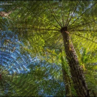
Ah yes, a painter would notice that. Speaking of fun, anyone who wants to play around with further manipulation will find plenty of options in photo-editing software. As an example, I superimposed the regular version onto the negative and changed the mode of the top layer to ‘darken’ to produce this:
Steve Schwartzman
January 25, 2018 at 10:03 AM
I’m sorry I can’t open it. Years ago my old Minolta was beginning to fail and sometimes images would come out superimposed over each other. Those are some of my most prized images.
melissabluefineart
January 26, 2018 at 8:41 AM
I’ve e-mailed you a copy of this variation.
I’ve had experiences where an accident produced an interesting image. Photographers noticed solarization in chemical photography when a negative or print accidentally got briefly exposed to light during development. Man Ray was especially interested in that effect.
Steve Schwartzman
January 26, 2018 at 9:08 AM
Oh, the places you go! I like the inversion experiment.
Dianne
January 25, 2018 at 10:26 AM
There were so many scenic things to see on the August–September trip that I’m still showing pictures five months later.
In my reply to the previous comment I showed yet another non-realistic version of today’s photograph.
Steve Schwartzman
January 25, 2018 at 10:54 AM
Surprising!
Fotohabitate
January 25, 2018 at 1:47 PM
I’m pleased to see it was a surprise for you. So much the better.
Steve Schwartzman
January 25, 2018 at 4:01 PM
That’s amazing – really fairy-like. What also jumped out at me was that in the inversion the tonal variations were stronger – unless you tweaked them?
anna warren portfolio
January 25, 2018 at 9:08 PM
Good question. No, the fairy-like negative was a “straight” negative with no other adjustment. In my reply to Melissa a few comments earlier I included an altered version of the negative just to show one of the many things that can be done with software.
Steve Schwartzman
January 25, 2018 at 9:33 PM
Is it supposed to look like something in particular?
tonytomeo
January 25, 2018 at 9:28 PM
No, nothing other than the same forest with all the colors changed to their opposites. The commenter before you described it as fairy-like.
Steve Schwartzman
January 25, 2018 at 9:34 PM
Well, yes, it looks unreal; but I was looking at it thinking I was missing something. It reminds me of old fashioned photography, like with film.
tonytomeo
January 25, 2018 at 9:44 PM
Ah, film. For decades I did chemical photography, which was the only kind back then. That meant looking at negatives and projecting them down onto an easel. Once in a while I used to print a positive as a negative just for the effect. Everything is so much easier now.
Steve Schwartzman
January 26, 2018 at 7:06 AM
You may have noticed though, that although easier, pictures do not seem to be as artistic as they once were. In a way, they are much more realistic, but something is lacking.
tonytomeo
January 26, 2018 at 8:52 PM
What I’ve noticed is that the best of my old silver-based prints have a certain quality that I’ve not seen duplicated in digital prints. Perhaps someday, as digital keeps improving.
Steve Schwartzman
January 26, 2018 at 9:15 PM
I think it will evolve. The good pictures that I remember from the 1960s and 1970s were very different from when cameras were first invented . . . and NO one smiled!
tonytomeo
January 26, 2018 at 9:17 PM
Right: no one I know has ever had to use a neck clamp to hold still for a photographic portrait.
Steve Schwartzman
January 27, 2018 at 6:44 AM
What is a neck clamp? It sounds Victorian, and a good reason to not smile for a portrait.
tonytomeo
January 27, 2018 at 10:09 AM
This is what I had in mind:
https://www.dpreview.com/forums/post/56543348
Steve Schwartzman
January 27, 2018 at 10:16 AM
Goodness! It is just like it sounds!
tonytomeo
January 27, 2018 at 10:18 AM
As you pointed out, it makes us appreciate advances in science.
Steve Schwartzman
January 27, 2018 at 10:36 AM
Awesome! I tapped the blank box on my mobile and it looked EXACTLY the lavender I was hoping for.
That was fun, Steve. I often dream of the temperate rainforests of Glacier NP, which look very similar, with giant cedars and pines.
Shannon
January 26, 2018 at 7:02 AM
We’ll commend you for your good imagination, Shannon. Only once before did I offer up a negative, back in 2015:
https://portraitsofwildflowers.wordpress.com/2015/11/14/the-color-and-the-curve-that-caught-my-eye/
The next post will give you a glimpse over into Glacier National Park, where we spent two days on this trip. While you were away from blogging I showed a few pictures from there:
https://portraitsofwildflowers.wordpress.com/tag/glacier-national-park/
Steve Schwartzman
January 26, 2018 at 7:16 AM